
Okay, so maybe this title is a touch corny, but it doesn’t make it any less true. If we want to get technical, we know that black is not a colour, it is the result of the complete absence or absorption of visible light. In the printing world however, black is considered a colour. There are many different shades of black, and there are also many ways to produce it.
One common method is by using black ink (or printing in black and white), which is what many people use with their printer at home. The end result of this is a black which is only as black as the ink used, meaning, black is subjective based on the amount of light and also the medium it is printed on.
Black can also be made up using a CMYK colour breakdown. More ink is used through this process, resulting in a darker, richer black.
Let’s break it down
Have you ever had something printed and the end result didn’t look like what your digital proof looked like on your computer screen? Perhaps the black came out looking dull or washed out? This is largely due to the use of the colour breakdown used in digital printing: CMYK.
There is nothing wrong with using CMYK, however it really helps to understand how it works so you can make the most of your print. The CMYK colour process is made up of four primary colours: Cyan (C), Magenta (M), Yellow (Y), and Black (K) - all of which make up a large spectrum of colours.
When to use Rich Black, and when not to
When printing rich black, the full range of CMYK is used, allowing more ink to be applied, resulting in a deeper and richer black outcome on the printed medium. Rich black should be used where large areas of solid black ink are required; the background colour for your marquee for example.
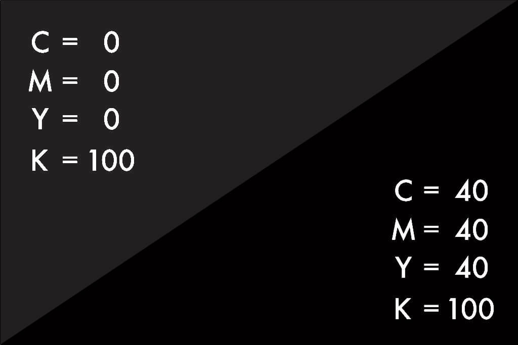
True black (also known as standard black, or key black) is preferred for smaller print areas, or “spot” use. Think newspapers or magazines. If you were to use rich black, it may cause a bleed in the colour due to all the extra inks being used, resulting in a less than sharp finish to the edges. This is more evident on white backgrounds. When you get to more complex things like photos, these are typically printed as is, however there are ways to adjust colour saturation in design software such as Photoshop.

Summary
In the world of design, black is just as complex and diverse as any other colour. If colour and design are important to you, it is worth understanding the colour break down and the different processes that offer varying results.
When it comes to designing your marquee artwork, we recommend using rich black as your background colour, or for any larger area with a solid black fill. For things such as text, or spot printing, it is safer to stick with true black to prevent any appearance of colour bleed.
If you have any further questions regarding what colours to use, or any general advice regarding marquee artwork, feel free to get in touch.