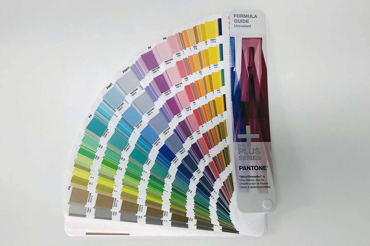
In 1963, Pantone revolutionised the printing industry with the PANTONE MATCHING SYSTEM®, or as it is commonly known, PMS.
Pantone produced a colour book which became the industry reference where two people in completely different locations could discuss a colour and be certain they are seeing the same thing. A lot more accurate than just saying, “It’s supposed to be sky blue”.
Why is Pantone important?
Printers print in what is called a “four colour process” using four different colour inks; Cyan (C), Magenta (M), Yellow (Y) and Black (K). Normally, a CMYK colour is expressed in values like 10/23/50/21 - but all it is, is an instruction to a printer about how much ink to shoot onto the material. It doesn’t take into consideration all the different factors that could affect the final appearance like printer profiles, age, calibration, base ink accuracy, temperature, and many other factors.
The best way to think about CMYK is that the colour is just a recipe - imagine being able to taste the original cake from a recipe before making it yourself. It may take adjusting the recipe, the cooking equipment, or the brand of ingredients used before you can recreate the original taste. Without tasting the original cake, you could get many variations from the one recipe. Understandably, not many people will get the opportunity to taste the "original cake", but this is exactly what Pantone allows us to do, even with "multiple chefs in the kitchen”.
This means that if you provide us with a Pantone reference colour, we’ll be able to look it up in our Pantone book and use it as a reference to match it exactly to what the final product’s colour should look like.
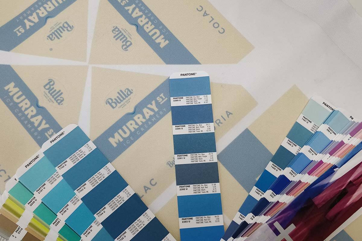
We can then make some adjustments during our manufacturing process which ensures that the final product is as colour accurate as possible based on what you know your colour to actually look like.
How Pantone colours impact Printed Marquees
In all cases, we will ask you if you have a Pantone reference colour that you’re trying to match for backgrounds, logo colours, etc. If you do, we need the colour number such as 123C, 289C, etc. Typically these can be found in documents like Brand Guidelines or Style Guides and all big names across all industries (even governments) use pantone for their marketing.
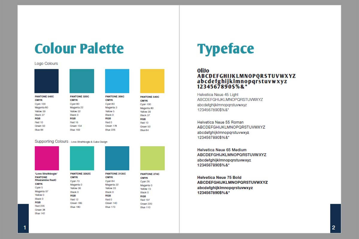
Once we’ve received this colour, we will reference it on your artwork and we’ll use that colour when printing your marquee. It is very important that you provide us with Pantone colours if you have them, otherwise the printers are relying solely on the CMYK breakdown which may not necessarily produce the desired colour, and you are left with an inaccurate colour used on your product.
Beyond the differences in how different printers print, there will be an apparent difference between how the colour appears on your screen, and how it will print. Again, this is further reason why we ask for the standardised Pantone reference colour.
What we do with your Pantone colours
Prior to producing your printed marquee, we will run a range of colour sample swatches for any Pantone referenced colours in the print, and then re-adjust the artwork after referencing the print samples against the Pantone colour codes.
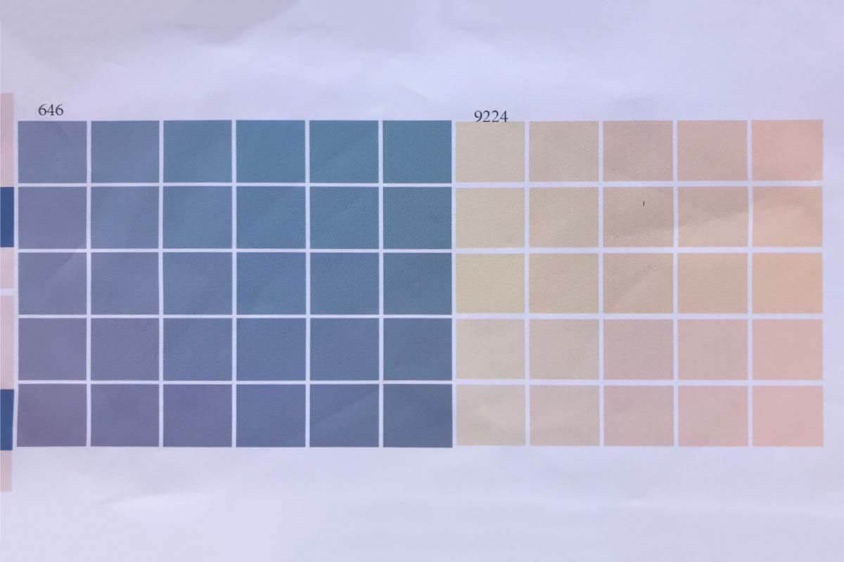
A range of colours are printed with small variations for us to be able to pick the closest possible match for your marquee
If the colours that print are not acceptably close to your Pantone reference, we will print a range of different CMYK breakdowns with slightly different variations and then find the perfect colour match after comparing to what it should be.
Once we find the best matched colour, we go back to your artwork and adjust it to use the right CMYK variant that will print the closest to your Pantone colour.
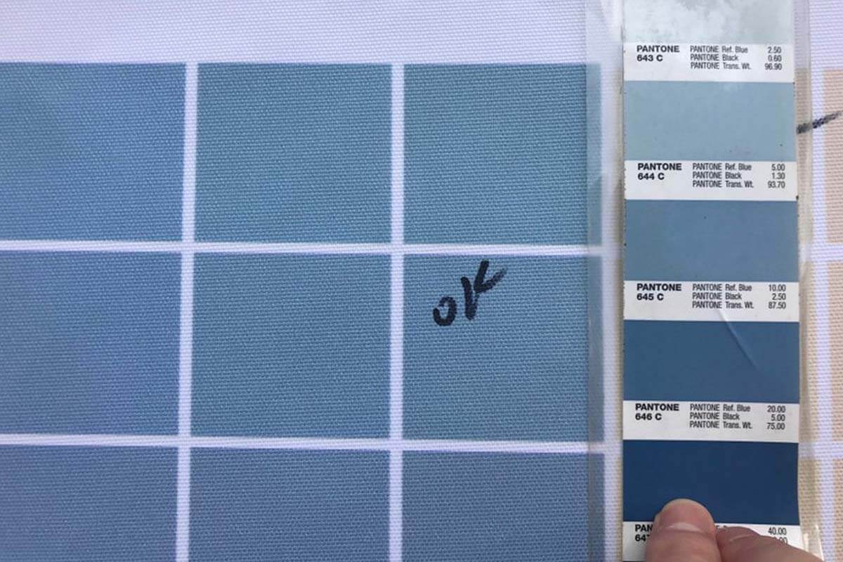
Only after this extensive process do we actually proceed into the manufacturing stage.
Don’t rely on what you see on your screen
We always request Pantone colours for printed marquees because what you see on your screen is guaranteed to turn out differently to what the final print will look like.
This stems from the fact that every single monitor has a different calibration setting and there are a range of different screen technologies that all reproduce colour in different ways. Think about a time when you visited an electronics store and browsed the TV section. Did you notice how that many of the screens are playing the same footage, yet some screens emphasise certain colours more than others?
Here is an example of two screens showing exactly the same artwork - one looks green, and one looks yellow! Imagine approving what you believed to be a yellow marquee, only to receive a green one!
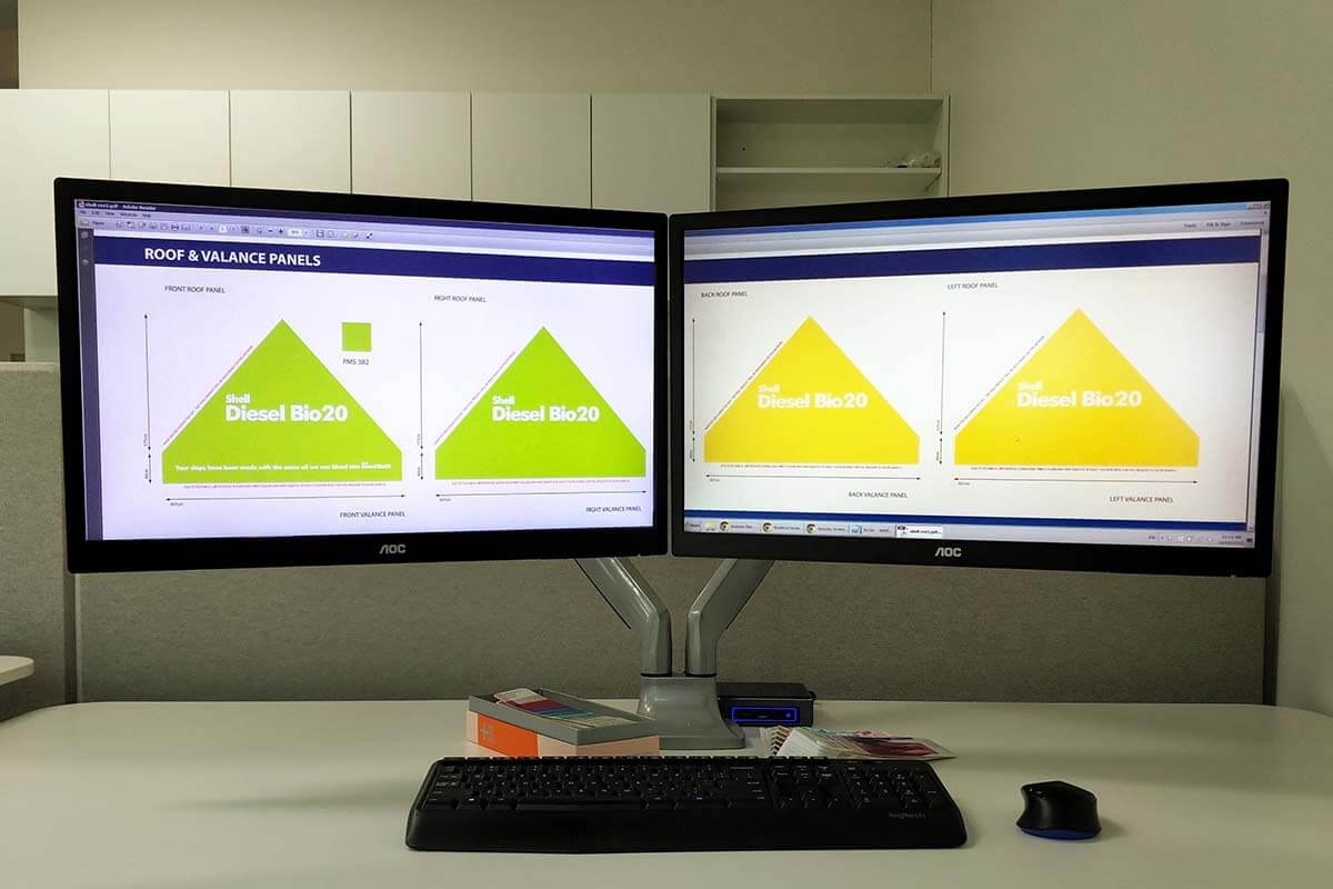
This problem is 100% solved by providing a Pantone colour reference because there is no doubt about what the final product should look like.

In this case, that’s exactly what we had, and we managed to get the colour spot on. Very happy client.
I don't have any pantone colours, what should I do?
There’s no need to worry, there are three ways that we can help you forward:
- We can do a routine colour sample of the CMYK colour and send you a sample prior to final production for review & approval.
- We can print you a range of slight variations of your CMYK colour and send it to you for review, and you can choose which one you prefer.
- Or, in the best case scenario, we can sit down together and review the Pantone book until we find colours that you’re happy with, and reference them on your artwork. The benefit of this option is that from this point, you’ll actually have Pantone colours to reference for anything else you get printed in the future!
Regardless of the way you choose to move forward, we are invested in making your marquee look good with you and are willing to work towards that in whichever fashion you choose.
Conclusion & Summary
Pantone developed the Pantone Matching System in the 1960’s which enables those that work in the print industry to discuss standardised colours to ensure colour consistency is maintained for clients.
We use Pantone colours when printing marquees to ensure that we can produce the most brand accurate marquees in the market. Once we have a colour reference from you, the client, we use that to print samples, and then adjust the artwork to ensure the final product looks as accurate as possible.
The final product will always benefit from a Pantone reference as what you can see on a screen is absolutely not a true representation of what the final product will look like.
For this reason, we will always request Pantone references when preparing your artwork for Pre-Production approval.
