We’ve put together a collection of a few of our favorite printed marquee designs, we’ll walk you through why they’re great designs and how you too can incorporate the design elements and principles into your designs too!
Okay, so you’re incorporating a printed marquee into your next event. Awesome! Next step, how do you want it to look? Do you have branding guidelines or are you open to creating something special? There are many things to consider when designing your printed marquee, so let's take a closer look together.
We’ll be focusing on these main printed marquee design elements and principles;
- Balance
- Contrast
- Proportion / Scale
- Colour
- Pattern
- Texture
Example 1: Waterfront Echuca Moama
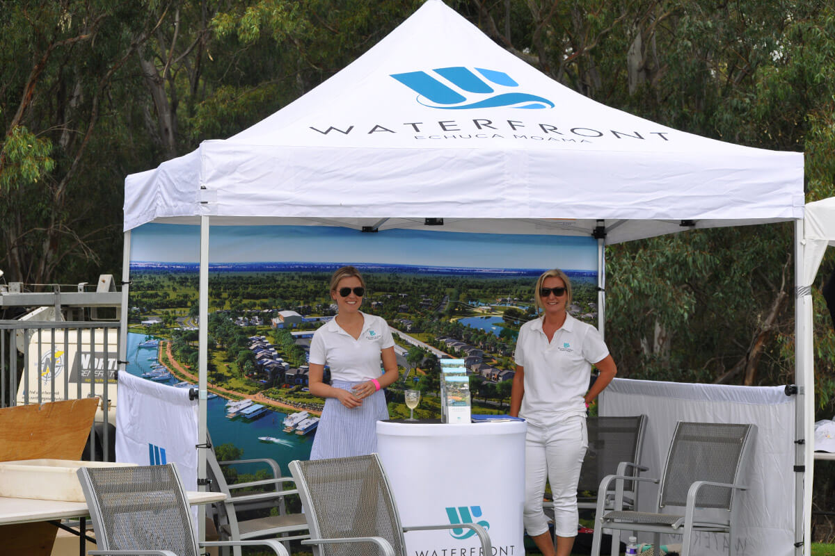
Is anyone else feeling serene, ready to sign up and live by the waterfront? Sign me up! This is a beautifully designed marquee, pinpointing the exact emotions to provoke a sea change. Ever heard the saying, a picture is worth a thousand words? Well in this case, it certainly is. Incorporating an image into your printed marquee design utilises prime real estate, no pun intended. It creates a wonderful backdrop to showcase your product, or communicate a feeling. Let's dive deeper into how using an image doesn’t make the overall design too busy.
Firstly, let’s look at the balance of the design. We’ve used a very simple colour scheme, which is on brand for Waterfront Moama, yet offers balance and continuity to the design. Using a few different shades of blue throughout the design creates a flowing affect which is complemented by all the negative space (white background).
Secondly, we have an excellent use of scale and proportion. Looking at the marquee roof design, the logo and text are well positioned, not only for design elements and principles, but also for catching the attention of your customers browsing in the distance - have you read our “how to design a marquee to catch your attention”
Thirdly, and additionally the image on the back wall creates a layer of pattern and movement into the overall printed marquee design, which allows your eye to move around the set up without being too overwhelmed.
Example 2: Essendon Bombers FC
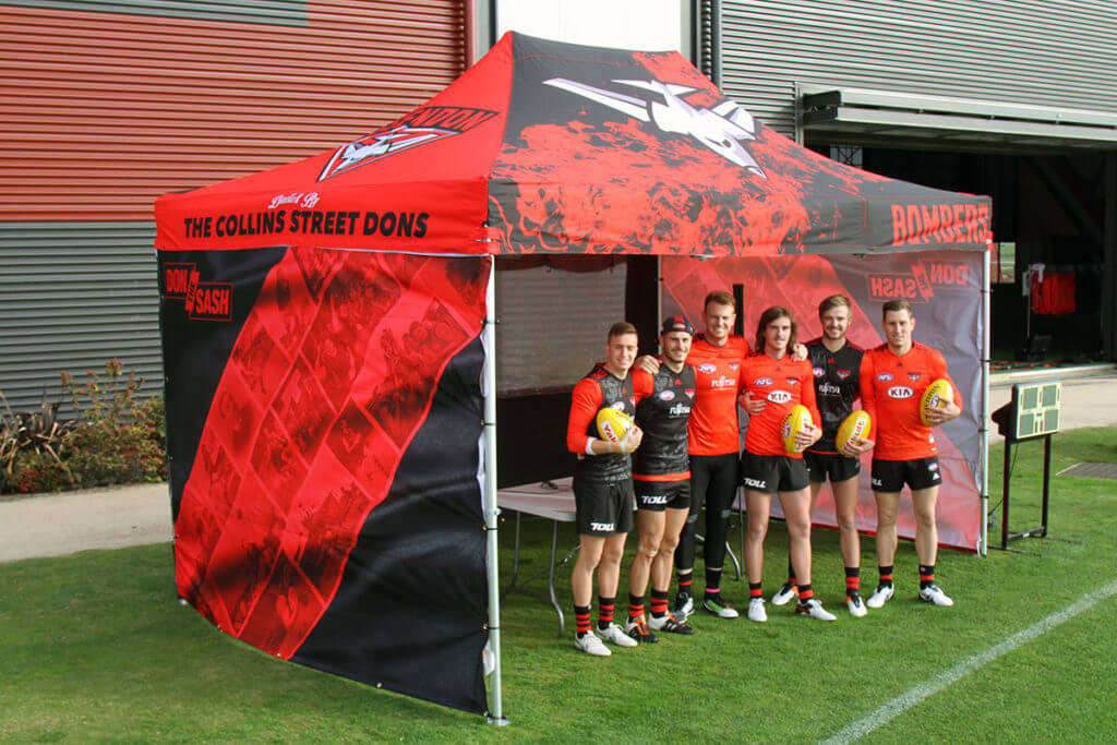
See the Bombers fly up, up! Carn the Bombers! Can you hear the roar of the crowd? What a great example of how we can really dial up a marquee and create additional interest into the design. Let’s take a look at why we loved being a part of this design and why it’s a favourite.
Firstly, we’re on brand. We’ve got our colours - red and black (and some white). You know at a glance of the eye what team this is. Winning! The marquee has now become a destination, you’ve attracted your client in the crowd, and that can be half the battle sometimes.
Secondly, if we look at the real estate on the 3m x 4.5m printed marquee, we’ve got two designs - one on the 4.5m front and one on the 3m side. We’re ticking off some big design elements and principles doing this - we’re using contrast, pattern, texture, and colour. Not only are we utilising contrast between the two sides, mainly being attributed to the red and black, we’ve got the pattern creating movement and evoking a fiery passion with the bomber flame diving through flames. Are you fired up? Ready to cheer your team on!
Finally, we have our marketing communication taking up prime real estate on the 3m side walls - Don the Sash - paired with the historic photos of past players on a red sash. Bringing in the history of the team into a clever take on the jersey the players wear. Notice how the sash with photos is on an angle directed back up to the marquee top? Lines create movement and direction, moving your eye back to the roof for you to take more of the printed marquee design in. Clever huh!
In addition to the above points, it’s also worth mentioning this design is creating opportunities for future events, offering different positions for the marquee to “face” the crowd. Depending on the set up, we can use the 3m side as the “front” of the shop, we’ve got the teams logo on the 3m roof panel utilising excellent proportion to make a large impact. Not every set up will be the same, so if you’ve got some flexibility in your printed marquees design, we can create different front of shops for you too!
Example 3: Ricks Mobile Slotcars
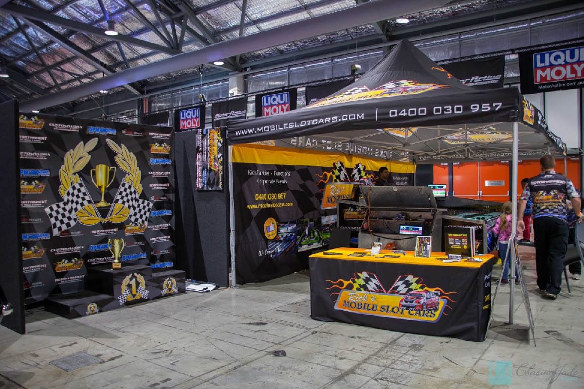
Racers are you ready? Wow, what a fun design! Can you feel the energy already? Ricks Mobile Slotcars is fun and energetic, creating the impact well before you arrive at the marquee. Let’s look together and discover how you too can create this much energy into your design.
Firstly, let’s take a look at Ricks Mobile Slotcars. We’ve got colour, pattern, images, logos and text to include into our printed marquee design to communicate your energy and vibrance. Okay let’s start with a black background this time to create contrast and provide negative space within the design. This will give the overall design much needed balance, also giving the marquee a moodiness elevating the energy.
To create the vibrancy and energy within the printed marquee design, the logos play a large role. We’ve got warm and bold colours - yellow, orange and red contrasting off the black roof paired with the white text. They are balanced by applying scale and proportion, making sure they have some negative space.
Finally, if we look at the pattern applied to the design, we can see it in the grid flags in the logo which is also used in the background of the back wall also creating a texture to the printed marquee design. Pattern creates movement within a design, allowing the eye to wander and discover other areas, which in turn gives opportunity to the client to find call to action information, such as websites and phone numbers.
Example 4: Dewalt
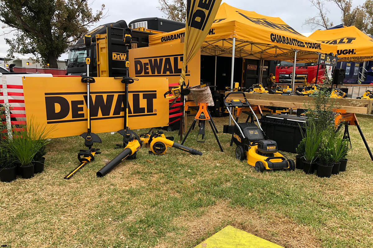
Loud and proud. Guaranteed tough. Need to know more? Are you team yellow? We most certainly are on Team Yellow! This is a stellar example of how to stay on brand, have a minimal printed marquee design which is strong and eye catching. Let’s take a look together to discover why this design is far from mellow yellow.
Own your branding. DeWalt are known for their yellow and black branding, and slogan of guaranteed tough. So you’ve got a Pantone colour? Awesome! We can directly match that colour, so you don’t need to browse through a colour book, you’re going to get the exact colour which is keeping you on brand. Keep in mind that when we print colours, they will slightly differ depending on the fabric / paper / material that it’s printed on. If need be, we can always print samples so you can see first hand what the final product will look like - have you read “how to match my branding colour” article?
Utilising a minimal design, we can elevate the communication to your client. So we’ve got two colours we’re using, and two messages in two locations. DeWalt, on the roof panel. Guaranteed tough, on the valance panel. The winning combo is the key. We want to use your brand name or logo on the roof panel, as this is what clients can see from far away something they can recognize, and your message (or call to action information) on the valance panel which is what your client can read when they’re up close.
To seal the deal, we’ve utilised excellent scale and proportion into the printed marquee design. The DeWalt branding is covering a larger than usual surface area for a logo, creating a big impact to the client. It’s tough. Guaranteed tough.
Conclusion
Got some ideas up your sleeve now? We’ve looked at lots of printed marquee designs and worked out together what makes them so great. Let’s recap together.
- Own your branding!
- Elevate your design by utilising the negative space.
- Use a colour scheme which best represents your brand, the message you want to communicate or the feelings you want to evoke.
- Incorporate your logos using scale and proportion to create an impact.
- Using pattern creates movement within the design, add call to action information or more about who you are!
- Maximise the real estate on your marquee by designing keeping your client in mind and their experience.
We’re ready to get started on designing your dream marquee, let’s chat about how we can elevate your business today!